


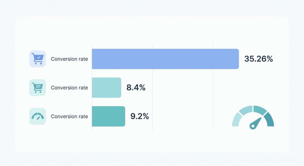
Quick Answer: UX design conversion rate gains come from removing friction, not adding polish. Baymard Institute puts the achievable lift from checkout usability fixes alone at 35.26%, while Google and Deloitte measured an 8.4% retail conversion increase from a 0.1-second faster mobile load. Small, tested changes compound faster than redesigns.
What is UX design conversion rate optimization?
UX design conversion rate optimization is the practice of improving how a site works so more visitors finish what they came to do. It covers navigation, forms, copy clarity, load speed, and checkout flow. The measure is behavioral: completed purchases or submitted forms, not survey scores or design taste.
TL;DR
- Baymard Institute documents a 35.26% average conversion lift available to large ecommerce sites from checkout usability fixes alone, worth roughly $260 billion across US and EU sales.
- Google and Deloitte measured 8.4% higher retail conversions from a 0.1-second mobile speed improvement across 37 brands and 30 million sessions.
- Five usability testers surface about 85% of the problems in a design, which makes research cheap enough to run monthly.
How much does UX design affect your conversion rate?
Enough to move a P&L line. The credible numbers come from controlled comparisons rather than opinion surveys: a 35.26% checkout lift documented by Baymard Institute, an 8.4% retail increase from 0.1 seconds of mobile speed measured by Google and Deloitte, and 8% more sales at Vodafone Italy after a 31% LCP improvement.
That last result matters because it was A/B tested server side, so the sales gain isn’t a seasonal accident. Google’s roundup of Core Web Vitals business impact collects a dozen similar wins, including Lazada, which tripled LCP speed and saw mobile conversions rise 16.9%.
The UX design conversion rate payoff is rarely a visual refresh. It’s the unglamorous work: fewer fields, clearer error states. Teams that treat UI/UX design as a growth function rather than a decoration budget tend to find these wins first.
UX conversion rate statistics worth checking before you quote them
The most repeated number in this category is Forrester’s claim that $1 invested in UX returns $100, a 9,900% ROI. It’s real, it dates to 2016, and Maze now flags it as based on older research. Quote it as direction, not forecast. A CFO who searches it will find the date.
Does page load speed actually change conversions?
Yes, and the returns are front-loaded. Google and Deloitte’s Milliseconds Make Millions study found a 0.1-second mobile improvement raised retail conversions 8.4% and average order value 9.2%, with travel conversions up 10.1%. Portent’s analysis of over 100 million page views puts a one-second page at roughly 3x the conversion rate of a five-second page.
Front-loaded means the curve flattens. Cutting 8 seconds to 6 buys you far less than cutting 3 to 1. So measure before you guess: run the page through PageSpeed Insights and read the field data section, not the lab score.
Most sites have room here. In the 2025 HTTP Archive Web Almanac, only 48% of mobile sites passed all three Core Web Vitals, and LCP was the weakest metric at 62%. Heavy hero images and render-blocking JavaScript cause most of that, which makes speed a website development problem as much as a design one.
Where does landing page UX leak the most revenue?
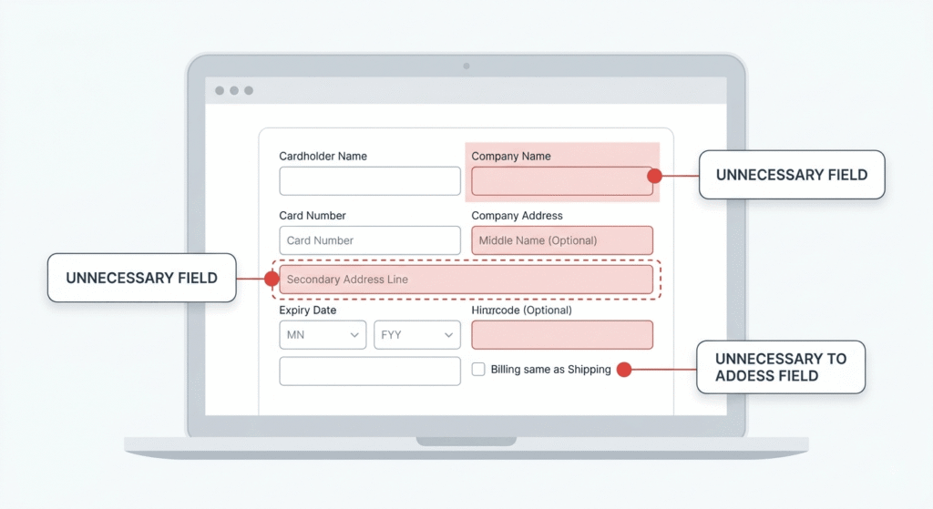
The form. Baymard’s checkout benchmark, updated in 2025, found the average US checkout displays 23.48 form elements by default against a tested ideal of 12 to 14. Most checkouts can cut 20% to 60% of those elements without losing anything the business needs.
Cost surprises do the rest of the damage. 48% of US shoppers who abandoned a cart cited shipping, tax, or fees appearing late in the flow, and that has been the top fixable reason in Baymard’s survey for six straight years. Show the full total on the cart page.
Landing page UX follows the same logic on the lead-gen side. One extra required field. One hero image that pushes the button below the fold. Our conversion-focused website build for RevSquared AI started from exactly this kind of audit.
How do you run usability testing without a research budget?
Watch five people. Nielsen and Landauer’s model shows five participants surface roughly 85% of usability problems in a design, and Nielsen’s advice was to run three rounds of five rather than one round of fifteen. You fix between rounds, so each round tests a better design.
Session replay covers the gap between rounds. Tools like Hotjar show rage clicks and drop-off points at scale, while Maze handles recruiting when your own traffic is too thin to sample.
A 30-day UX optimization plan you can ship
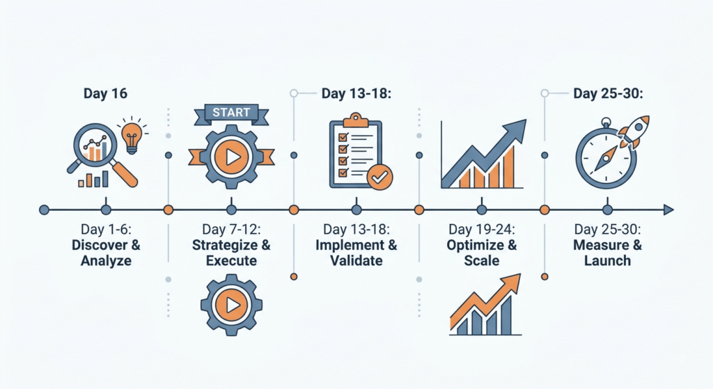
Thirty days is enough to find and fix the top friction points in one funnel, provided you don’t try to redesign anything. Pick one funnel and one metric, then ship weekly. Here’s the sequence that works on most sites, regardless of platform.
- Days 1 to 3: pull field Core Web Vitals and funnel drop-off by device. Write down the two worst steps.
- Days 4 to 7: watch 20 session recordings of people who dropped at those steps.
- Days 8 to 12: run a five-person usability test on the worst step.
- Days 13 to 20: ship the cheapest fixes first, usually field removal and cost transparency.
- Days 21 to 27: A/B test anything that changes layout or copy. Server-side testing avoids the rendering penalty.
- Days 28 to 30: recheck the metric, then start again on the next-worst step.
What each UX fix is actually worth
Effort and payoff don’t line up neatly. Some of the highest-return changes take an afternoon, while others need real engineering time. This table maps documented results to the work behind them, using published figures rather than agency estimates. Read it as a starting order of operations.
| Fix | Documented impact | Source | Typical effort |
|---|---|---|---|
| Reduce checkout form elements | Up to 35.26% conversion lift | Baymard Institute | Medium |
| Cut 0.1s from mobile load | 8.4% more retail conversions, 9.2% higher AOV | Google and Deloitte, 37 brands | Medium |
| Improve LCP | Vodafone Italy: 31% faster, 8% more sales | web.dev case study | High |
| Show all costs before checkout | 48% of abandoners cite surprise costs | Baymard 2025 survey | Low |
| Test five users per round | About 85% of usability problems found | Nielsen and Landauer model | Low |
| Stabilize layout shift | iCook: 15% better CLS, 10% more ad revenue | web.dev case study | Medium |
Common mistakes to avoid with UI/UX design
Benchmarking against the average wastes the most time. Reported ecommerce conversion rates for 2026 run from 1.4% on Littledata’s Shopify dataset to 2.66% on Dynamic Yield’s global benchmark, because each uses a different population. Your own trend line is the only honest comparison.
The second mistake is blaming mobile design for the mobile gap. Desktop often converts at roughly twice the rate, but a large share of that is intent: people browse on a phone, then buy on a laptop. Fix mobile friction because it’s real, not because the ratio says design is broken.
Third, redesigning everything at once. You lose attribution and can’t tell which change earned the lift.
Which UI/UX best practices should you fix first?
Sequence by evidence and cost. Start with cost transparency and form-field removal, since both are cheap and both sit on the highest-abandonment step. Move to speed next, because the Core Web Vitals data gives you a pass or fail target instead of a vague goal.
Save navigation and visual hierarchy for after those two land. That order moves the UX design conversion rate number fastest per hour spent. If you’re building something new rather than repairing it, folding research into MVP development is cheaper than retrofitting usability later.
Frequently asked questions
1. How much can good UX design increase conversion rate?
Documented lifts vary widely. Baymard Institute puts checkout usability improvements at 35.26% for large ecommerce sites, while Google and Deloitte measured 8.4% from a 0.1-second speed gain. Your own result depends on how much friction exists in the funnel before you start.
2. Is page load speed more important than visual design for conversions?
For transactional pages, usually yes. Speed has controlled, cross-vertical evidence behind it, including Vodafone Italy’s 8% sales gain from a 31% LCP improvement. Visual design matters most for trust and comprehension, which show up earlier in the buying funnel.
3. How many people do I need for usability testing?
Five per round is the standard starting point:
- Five participants surface about 85% of usability problems in a qualitative test.
- Three rounds of five beat one round of fifteen, because you fix between rounds.
- Add three to four users per distinct audience segment.
- Quantitative benchmarking needs 20 or more participants.
4. What is a good conversion rate in 2026?
There isn’t one number. US ecommerce averages cluster between 2.5% and 3.5%, but published benchmarks range from 1.4% on Shopify data to 2.66% globally, depending on dataset, device mix, and price point. Compare against your own prior quarter, not an industry average.
5. Does UX optimization help SEO too?
Yes, both directly and indirectly. Core Web Vitals are a confirmed ranking signal, and clearer pages reduce bounce. Nykaa recorded 28% more organic traffic from smaller cities after a 40% LCP improvement, per Google’s case study collection. The two goals point the same direction.
Conclusion
The UX design conversion rate case doesn’t rest on taste. It rests on a documented 35.26% checkout lift, an 8.4% retail gain from a tenth of a second, and a research method that costs five participants and an afternoon. Pick the worst step in your funnel, measure it, fix one thing, then measure again.