

Quick Answer Box:Mobile-first web development for small businesses focuses on designing and developing websites specifically for mobile users first. This approach ensures an optimized experience for the majority of visitors, significantly increasing both sales and effective lead generation by capturing mobile traffic and improving conversion rates.
What is Mobile-First Web Development for Small Businesses?
Mobile-first web development starts with mobile devices as the primary focus. This ensures websites are designed to deliver the best possible experience on smaller screens before scaling to desktop. With over 60% of web traffic now from mobile, a mobile-first approach is essential for small businesses aiming to boost engagement, drive more leads, and maximize sales.
Why Mobile Traffic Matters for Small Businesses
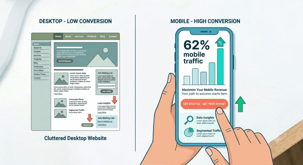
Mobile visits make up over 62% of global web traffic (DesignRush, Forbes Advisor). Consumers now use phones to research, compare, and purchase, and mobile commerce generates over 70% of global eCommerce traffic. Ignoring mobile means missing a significant percentage of your potential customers.
Google’s mobile-first indexing ranks websites based on their mobile version. If your site isn’t mobile-friendly, your business will rank lower, losing essential mobile traffic. For growth and visibility, mobile first web development is now a necessity.
The Importance of Responsive Website Design
Responsive website design ensures your site adapts to all devices. While responsive design is vital, a mobile-first approach guarantees user experience for mobile is established from the start, yielding better engagement and lead generation results.
The Impact of Mobile-First Design on Sales and Lead Generation
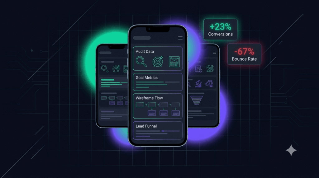
Mobile-first strategies deliver strong business growth. Small businesses adopting mobile-first web development experience conversion rate increases up to 23% and bounce rate drops up to 67% (WebRocket.ca, Convergine). A mobile-optimized site can mean higher sales Walmart Canada saw a 20% rise in conversions following their mobile upgrade.
For lead generation, small business web design that puts mobile first means smooth, quick forms, click to call buttons, and chat for instant engagement. Our High-Converting Website for RevSquared AI case study shows how mobile site improvements directly boost inquiries and appointments.
Optimizing the mobile lead generation funnel ensures prospects can act immediately, easily submitting forms or contacting your team. This direct conversion path keeps your sales pipeline full and helps differentiate your small business.
Mobile-First vs. Responsive vs. Adaptive Web Design
| Approach | How It Works | Pros | Cons | Best For |
|---|---|---|---|---|
| Mobile-First | Designs start for mobile, scale up | Best on mobile, improved UX, better SEO | Requires up-front focus | SMBs prioritizing mobile |
| Responsive | Layout adapts to all screens | Easier maintenance; supports all devices | May not fully optimize mobile | General websites, blogs |
| Adaptive | Fixed layouts for each device type | Custom per device | More costly, complex maintenance | Enterprises, special cases |
Mobile-first web development ensures your top calls to action, navigation, and vital information are easily accessed by mobile users, maximizing conversions and engagement.
Key Elements of Effective Mobile-First Small Business Web Design
Your small business web design should focus on:
- User Experience (UX): Clean, fast, intuitive interfaces that guide users to take action quickly.
- Navigation: Thumb-friendly menus and buttons that are easy to find and tap.
- Calls to Action (CTAs): Place key CTAs such as “Call Now” where users see them first.
- Speed: Mobile users abandon sites loading in over 4 seconds, so compress images and streamline your code.
- Prioritized Content: Put your most important details contact info, services, bookings front and center.
- Accessibility: Ensure legibility with good contrast, scalable fonts, and big tap targets.
- Integrations: Seamlessly integrate payment, scheduling, chats, and CRM tools to streamline lead generation.
Explore High-Converting Website for RevSquared AI and Prompt Generator AI to see success stories. Visit our Design page for more tips.
User Experience and Content Strategy
Effective mobile-first content is concise and visually focused. Guide visitors from interest to lead or sale with clear headings, bite-sized info, and intuitive actions.
Website Conversion Optimization for Mobile Commerce
With over 70% of online shopping traffic from smartphones, website conversion optimization for mobile commerce is a must. Key mobile conversion best practices:
- Offer simplified checkout with mobile payments like Apple Pay and Google Pay.
- Optimize product pages for instant loading.
- Enable autofill and one-tap checkout to lift completion rates.
- Show trust badges and reviews prominently.
- Avoid intrusive pop ups or overlays that disrupt the experience.
This mobile first approach helps maximize lead generation and sales conversion. Tools from Wix and professional support from our Development team can provide custom, conversion-driven solutions.
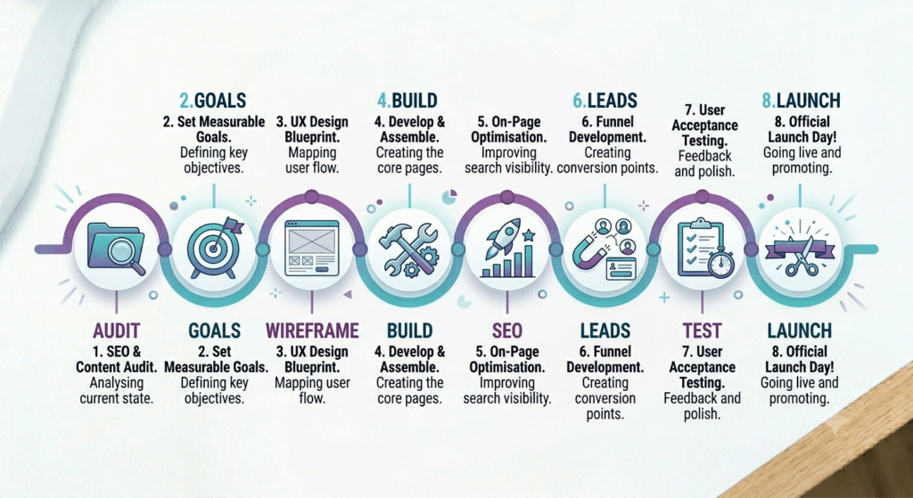
How to Implement Mobile-First Web Development
- Audit Your Site
Use analytics to find mobile usage and identify pain points. - Define Goals
Set lead generation and sales priorities for mobile visitors. - Sketch Mobile Wireframes
Start design focused on mobile, not desktop, prioritizing essential content and navigation. - Build Using Mobile-First Best Practices
Develop for speed, accessibility, usability. - Optimize for SEO
Pass Google’s Mobile-Friendly Test, structure content for search and users. - Integrate Lead Generation Tools
Add chat, quick forms, and clickable calls to action. - Test on Real Devices
Check function and speed on various phones and operating systems. - Launch, Monitor & Iterate
Review analytics, fix issues, and refine for ongoing improvement.
For expert help, consult our Design, Development, or MVP teams.
Common Mistakes in Mobile-First Small Business Web Design
- Not going truly mobile-first: Simply shrinking a desktop site causes mobile usability issues.
- Overcrowding small screens: Too much content leads to confusion and high bounce rates.
- Ignoring accessibility: Poor contrast, small fonts, or untested elements limit usability.
- Slow load times: Heavy images or code frustrate users and hurt rankings.
- Skipping real-device testing: Unaddressed layout or usability issues kill conversions.
- Annoying pop-ups: Disruptive overlays lead to lost leads and lower rankings.
- Not monitoring performance: Without analyzing post-launch data, improvements won’t happen.
Regular testing and feedback help prevent these mistakes and keep your mobile site driving results.
FAQs
1. How does mobile-first web development differ from responsive and adaptive design?
Mobile-first means designing for mobile before anything else. Responsive adapts a single design for all screens, while adaptive creates device-specific layouts. Mobile-first prioritizes mobile user experience and SEO.
2. What are the first steps a small business should take to go mobile-first?
Analyze your current mobile traffic and pain points. Define the most important mobile actions for your business, and start with mobile wireframes focusing on simple navigation and clear CTAs.
3. How quickly can switching to mobile-first show improved sales or lead generation?
Improvements in conversion rates and leads can appear within weeks of launching a mobile-first redesign. Increased engagement and lower bounce rates are often seen in the first month.
4. What are the most common technical issues seen in small business mobile sites?
Slow loads, tiny buttons, overlapping content, poor form autofill, and lack of real device testing are top technical reasons for poor mobile performance.
5. Is a mobile-friendly site enough, or is true mobile-first better?
A mobile-friendly or responsive website helps, but a mobile-first site built for mobile from the start yields higher conversions and stronger search visibility.
Conclusion
Mobile-first web development is the gateway to higher sales and better lead generation for small businesses. By focusing on mobile traffic and optimizing user experience, your business attracts more customers and stays ahead of the competition. Start your mobile-first journey today with expert strategies and support for sustained digital growth.