

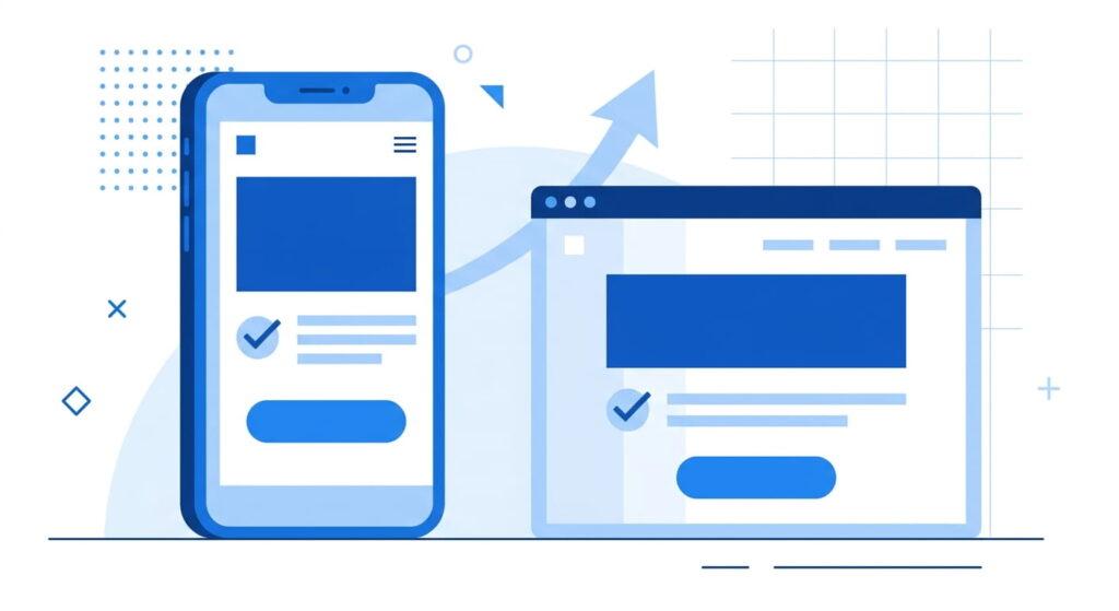
Quick Answer: The landing page best practices that work for U.S. service businesses in 2026 come down to one offer, one action, and a page that loads fast on a phone. Match the headline to the ad or query that sent the visitor, cut the form to four fields, put proof beside the button, and write in answer blocks that AI Overviews can quote.
What Is a Website Landing Page, Exactly?
A website landing page is a standalone page built for a single action. Someone clicks an ad, an email, or a search result, arrives, and either books, calls, or leaves. Unlike a homepage, it carries no navigation menu competing for attention and no second offer hiding below the fold. One audience, one promise, one button.
A roofer bidding on “emergency roof repair” and a family law firm bidding on “child custody attorney” are buying two very different states of mind. A homepage speaks to neither.
TL;DR
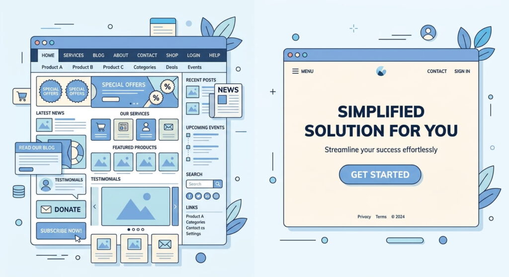
- One page, one offer, one call to action. Pages stacking multiple offers convert dramatically worse than single-offer pages.
- Start with mobile-first design. Mobile passed desktop for good, and the large majority of landing page traffic now arrives on a phone.
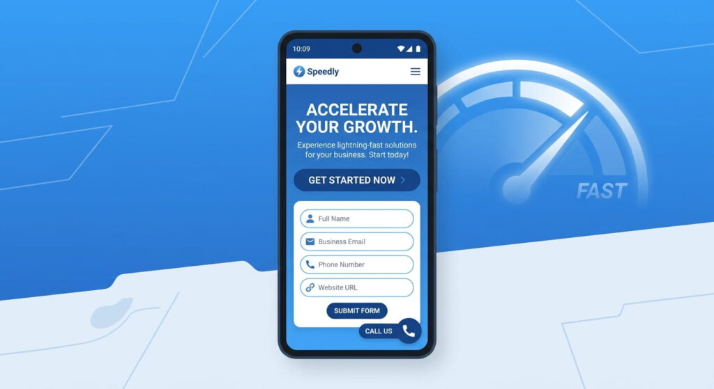
- Treat page speed as revenue. Google’s threshold for a good largest contentful paint is 2.5 seconds, and slower pages lose visitors before the headline renders.
- Structure copy as questions and short answers so AI Overviews have something clean to pull from.
Why Do Landing Page Best Practices Look Different in 2026?
Two things shifted. Search results now open with an AI-generated summary on a large share of commercial queries, so fewer people click through to anyone. And mobile stopped being the secondary experience. The page that wins answers fast, loads fast, and asks for very little in return.
The gap between an average page and a good one is wide. Unbounce’s benchmark data from Q4 2024 put the median conversion rate for commercial and professional services at 6.1%, while the top quartile of pages in the same category hit 14.1%. Legal landed at 6.3% median against 13.1% at the top. Same traffic, same industry, roughly double the outcome.
Treat published averages carefully. A global average that blends newsletter signups with quote requests is not a target you can plan against. Your own 30-day baseline is.
How Do You Design a Landing Page That Converts?
Start from the click, not the layout. If you are working out how to design a landing page from scratch, the phrase that brought the visitor here belongs in your headline almost word for word. Message match tells someone in half a second that they are in the right place. Everything else exists to remove doubt between that headline and the button.
Mobile-First Design Is the Baseline, Not a Checkbox
StatCounter measured mobile at 54.23% of global web traffic in December 2025, and Unbounce has reported that roughly 83% of landing page traffic specifically comes from mobile. Design at 390 pixels wide first, then let the layout grow.
Practical rules: the call to action visible without scrolling, tap targets at least 44 pixels tall, phone numbers as tappable links. Sticky call buttons work well for trades and clinics. Skip the hero video on mobile, since it delays the thing you want people to read.
Page Speed Belongs in Your Conversion Math
Google’s Core Web Vitals set three targets, measured at the 75th percentile of real visits: largest contentful paint under 2.5 seconds, interaction to next paint under 200 milliseconds, and cumulative layout shift under 0.1. Test any page free in PageSpeed Insights and watch the field data section, not just the lab score.
Most service-business pages fail for boring reasons. Uncompressed hero images, four tracking scripts firing before content, a web font that blocks rendering, a chat widget loading on page load instead of on scroll. Fixing those four things usually does more than a redesign. Our conversion-focused website development work starts here, because a fast page makes every later test cleaner.
How Does Landing Page SEO Work Now That AI Overviews Answer First?
Landing page SEO in 2026 has two jobs: rank the page, and feed the answer engine. Agency-side tracking through 2026 suggests AI Overviews now appear on a majority of local service queries, up sharply from early 2024. Google does not publish that number, so treat the direction as reliable and the exact figure as an estimate.
What earns a citation is unglamorous. Give a direct 40 to 60 word answer immediately under a question-shaped heading. State prices, timelines, and service areas as plain facts rather than marketing adjectives. Then mark the page up with LocalBusiness, Service, and FAQPage schema, and validate it in Google’s Rich Results Test.
Track the result in Search Console. Impressions climbing while clicks stay flat is the signature of AI Overview exposure. That still has value, because your business name sits inside the answer.
Build the Page in Seven Steps
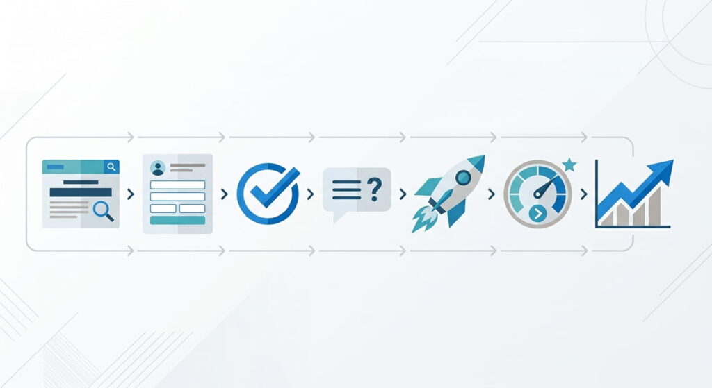
- Write the offer in one sentence a stranger would understand. Free estimate, same-week appointment, fixed-price consultation.
- Draft the headline from the exact search phrase or ad copy, then write a subhead naming the outcome and the timeframe.
- Strip the navigation. Leave the logo and a tappable phone number.
- Place the primary call to action above the fold, then repeat it after the proof section and again at the end.
- Cut the form to four fields. Unbounce found four-field forms converting far better than the eleven-field forms most sites still ship.
- Add proof that a skeptic would accept: license numbers, service area, named reviews with dates, before-and-after photos.
- Add an FAQ block of five to eight real questions, answered in short paragraphs.
What Do Top Landing Pages Examples Have in Common?
Look at any set of top landing pages in home services, legal, or dental and the pattern repeats. The differences are structural, not decorative.
| Element | Typical service page | Top landing pages |
|---|---|---|
| Headline | Company slogan | The visitor’s search phrase, restated as an outcome |
| Navigation | Full site menu | Removed, logo and phone only |
| Form | Nine to eleven fields | Four fields, progressive questions after submit |
| Proof | A logo strip | Dated reviews, license number, service area map |
| Load target | Untested | LCP under 2.5s on 4G |
| Typical result | Around 6% conversion | 13% to 14% conversion |
We rebuilt a page along these lines in this high-converting website case study, and the structural changes mattered more than the visual ones.
Common Mistakes to Avoid With Landing Page Best Practices
- Sending every campaign to one generic page. Separate pages per service and per city convert better because the message matches.
- Asking for a budget or a preferred appointment time before the visitor trusts you.
- Stock photography of people who have never touched your product. Real crew photos outperform it consistently.
- Testing button color instead of headline meaning. Small tests on low traffic produce noise.
- Ignoring the thank-you page, the cheapest place to book the next step.
Frequently Asked Questions
1. How long should a service business landing page be?
Long enough to answer every objection and no longer. Low-risk offers like a free estimate convert on short pages. High-consideration services such as legal representation or a roof replacement usually need more proof, pricing context, and process detail before someone will call.
2. What is a good landing page conversion rate in 2026?
For U.S. commercial and professional services, Unbounce benchmark data puts the median near 6% with top performers above 14%. Compare against your own 30-day baseline instead of an industry figure, since traffic source changes results more than industry does.
3. Do I need a separate landing page for each service?
Yes, in most cases. Separate pages let you match the headline to the search term, target the right city, and measure each service line independently. Build the highest-spend service first, then expand once that page has a stable conversion rate.
4. How do I improve landing page SEO without hurting conversions?
Keep the top of the page focused on the offer, then add depth below the primary call to action. The pieces that matter most:
- A question-shaped H1 or H2 with a short factual answer directly beneath it
- LocalBusiness, Service, and FAQPage schema, validated before launch
- Service area and pricing stated in plain text, not inside images
- Internal links to related service pages
- Unique copy per page, never a city name swapped into a template
5. Should I use a landing page builder or a custom build?
Builders are fine for testing an offer quickly. Custom builds win once traffic is steady, because you control page speed, schema, and tracking rather than inheriting a template’s bloat. Many businesses start on a builder and migrate after the offer proves itself.
Conclusion
Landing page best practices in 2026 are not a design trend. They are a short list of decisions: one offer, a headline that matches the click, a four-field form, honest proof, a page that renders in under 2.5 seconds on a phone, and copy an answer engine can quote. Service businesses that get those right stop paying for clicks that go nowhere. If you want a second set of eyes on your page, our UI and UX design team reviews conversion paths as part of every engagement.