

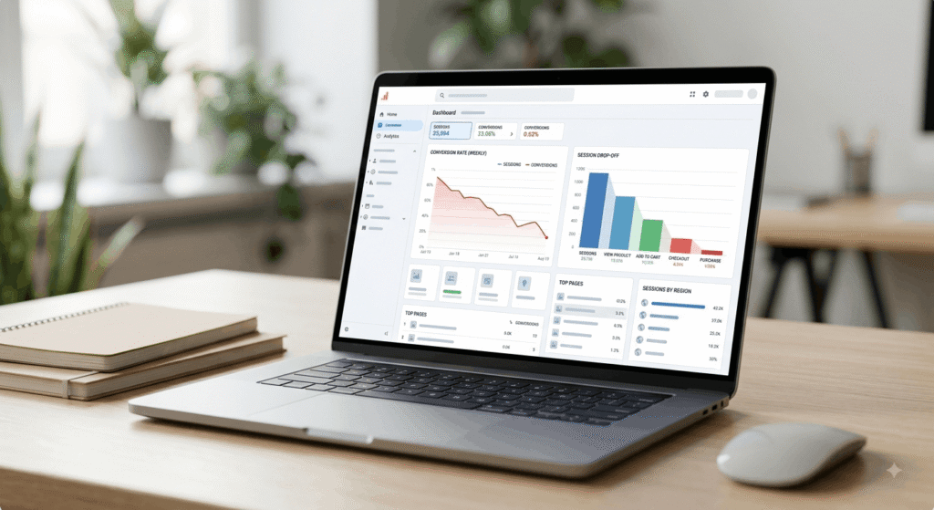
Quick Answer: The cost of bad UX is the revenue you lose to friction: abandoned carts, unfinished forms, higher support volume and expensive rebuilds. Baymard Institute puts recoverable US and EU checkout losses at $260 billion a year. Most of that damage is invisible in analytics until you go looking for it.
What is the cost of bad UX?
The cost of bad UX is the measurable revenue, time and trust a business loses when its interface makes people work harder than they should. It shows up as abandoned checkouts, failed form submissions, repeat support tickets and rebuild budgets nobody planned for. None of it arrives as a line item, which is why it survives budget review.
Marketing teams usually find it first, and they find it as a math problem. Traffic holds steady. Spend holds steady. Conversions slide. The site didn’t break. It just got harder to use, one deployment at a time. Anyone planning a website development project should price that drift before the build starts, not after two quarters of flat numbers.
How does bad UX affect revenue?
Bad UX affects revenue by removing people from the funnel before they pay. Google and Deloitte measured a 0.1 second mobile speed gain against an 8.4% lift in retail conversions and 9.2% higher average order value across 37 brands. The same study found travel conversions up 10.1%.
Where customer drop-off actually happens
Checkout is where customer drop-off gets expensive. Baymard Institute’s cart abandonment data, a running meta-analysis of 50 studies, puts the average abandonment rate at 70.22%, and it has barely moved in a decade. Baymard also estimates $260 billion in US and EU orders are recoverable through better checkout design alone, based on a documented 35.26% conversion gain available to the average large ecommerce site.

Here’s the part most articles leave out. In Baymard’s survey of 4,384 US online shoppers, 43% of abandoners picked “just browsing” as a reason, and no checkout redesign converts those people. Strip them out and roughly 30% of abandoners are genuinely winnable. That’s still a big number. It’s also the honest one to build a business case on.
A slow website experience is a revenue variable
Speed is the easiest part of the cost of bad UX to price, because it has been measured repeatedly under controlled conditions. Vodafone’s Core Web Vitals A/B test ran two visually identical landing pages and found the version with a 31% better Largest Contentful Paint produced 8% more sales and an 11% better cart-to-visit rate.
| Study | What changed | Business result |
|---|---|---|
| Google and Deloitte, 2020 | 0.1s faster mobile load | 8.4% more retail conversions |
| Vodafone A/B test, web.dev | 31% better LCP | 8% more sales |
| Akamai retail analysis | 100ms extra delay | 7% fewer conversions |
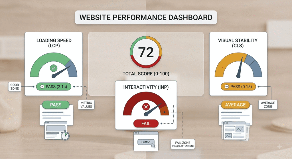
Google’s thresholds are specific: main content visible within 2.5 seconds, interaction response under 200 milliseconds, layout shift under 0.1, each measured at the 75th percentile of real visits. As of the May 2026 Chrome UX Report, 55.9% of tracked origins pass all three. A slow website experience isn’t a niche problem. It’s the median one. The same constraints shaped our high-converting website build for RevSquared AI.
What do bad UX sites have in common?
Bad UX sites rarely fail because of one broken screen. They accumulate. WebAIM’s February 2026 scan of the top million home pages found 95.9% with detectable WCAG failures and an average of 56.1 errors per page, up 10.1% from 51 a year earlier. The average home page now carries 1,437 elements, a 22.5% jump in a single year.
Complexity is the mechanism. Pages that use ARIA average 59.1 errors, while pages with none average 42. More code, same defect rate, more broken experiences for the people least able to work around them.
Design debt is the bill that keeps growing
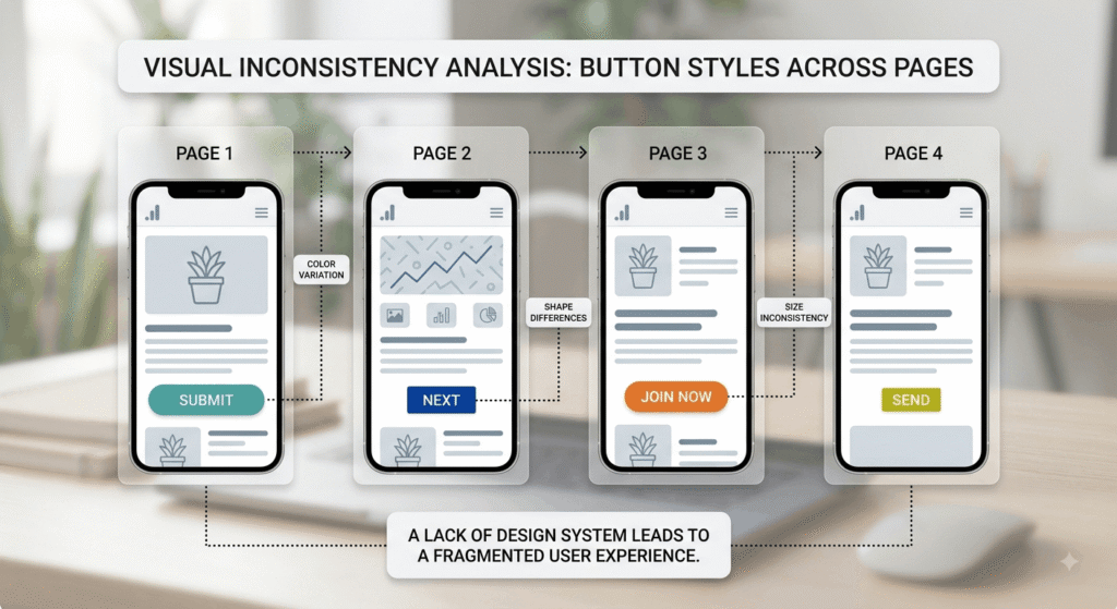
Design debt is what you owe after every shortcut: the modal that behaves differently from the other four modals, the form that validates on blur in one place and on submit in another, the component nobody deprecated. Each one is small. Together they’re why a user experience fails in ways your bug tracker never records, because nothing is technically broken. That’s the cost of bad UX in its slowest form.
The interest compounds in places you can measure: support volume, developer rework, onboarding time and how long it takes to ship anything new. Teams that treat UI and UX design as a maintenance discipline rather than a launch event pay that interest down instead of refinancing it every year.
How to measure UX ROI before you rebuild
The most repeated UX ROI figure, $100 back for every $1 invested, comes from Forrester and gets quoted far past its shelf life. Use your own numbers instead. A more recent Forrester Consulting study commissioned by UserTesting in August 2025 modeled a composite enterprise at 415% ROI with payback inside six months, driven partly by a 7.2% conversion increase.
Four inputs give you a defensible estimate:
- Sessions that reach the step you suspect is broken
- Current completion rate at that step
- Average order value or qualified lead value
- A conservative uplift of 5% to 10%, not the 35% ceiling
Multiply, then compare against the cost of fixing it. If the answer isn’t obvious, run session replays in a free tool like Microsoft Clarity for two weeks and watch rage clicks pile up on the same element. Recordings settle arguments that opinions don’t.
[Image: side-by-side screenshots of an inconsistent button system across four pages] Alt: “design debt shown as inconsistent buttons across bad UX sites”
Frequently Asked Questions
1. How does bad UX affect revenue when traffic stays flat?
Flat traffic with falling conversions is the signature. Google and Deloitte measured an 8.4% retail conversion lift from a 0.1 second speed gain, so small friction moves real money. Bad UX doesn’t reduce visits. It reduces the share of visitors who finish what they started, and that gap is where the loss lives.
2. What are the most common signs of bad UX sites?
Watch for four patterns that show up before revenue does:
- Rage clicks or repeat taps on the same element
- Drop-off concentrated at one checkout or form step
- Support tickets that describe the interface, not the product
- Pages failing Core Web Vitals on real mobile visits
3. Is a full redesign the only way to fix a bad user experience?
No, and full redesigns often reset design debt without removing it. Baymard’s checkout research points toward targeted fixes, since the average large ecommerce site carries dozens of documented, individually solvable issues. Fix the highest-traffic broken step first, measure for two weeks, then decide whether a rebuild is warranted.
4. Does bad UX hurt search rankings as well as conversions?
Both, in different sizes. Google’s page experience documentation says Core Web Vitals feed its ranking systems, while cautioning that good scores alone won’t lift a page above more relevant results. Speed behaves like a tiebreaker between comparable pages. The conversion effect is larger and arrives faster than the ranking effect.
5. How long does it take to see UX ROI after fixing usability issues?
Conversion changes show up in days, but field data lags. The Chrome UX Report refreshes on a 28-day rolling window, so speed fixes take roughly a month to register. Forrester Consulting’s August 2025 study modeled payback in under six months for a composite enterprise, with 415% ROI over three years.
Conclusion
The cost of bad UX is rarely one catastrophic failure. It’s 56 accessibility errors on a home page, a checkout that loses seven of ten carts, a landing page that renders half a second late and a design system nobody has pruned. Each one is survivable. Stacked, they decide whether your acquisition spend converts or evaporates. Start by measuring one broken step, price it honestly and fix that. If you want a second set of eyes on where your funnel leaks, talk to our team.