


Quick Answer Box: Mobile-first design means building a site for the smallest screen first, then expanding it for tablets and desktops. It stopped being optional for UK businesses in July 2024, when Google switched to crawling every site with its smartphone bot. Fail on mobile now and you fail everywhere.
What is mobile-first design?
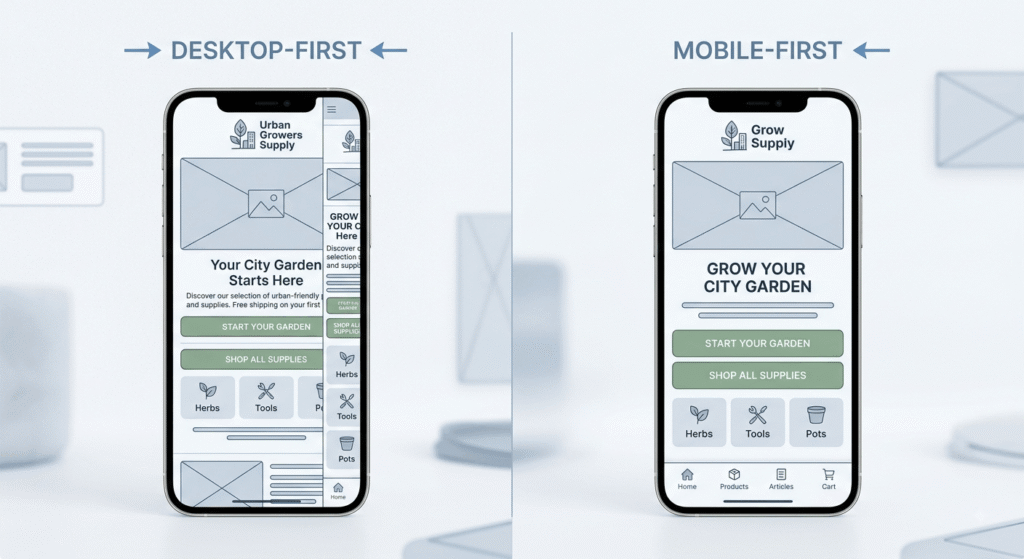
Mobile-first design is a build order, not a screen size. You design and code the phone layout first, decide what earns space on a 375-pixel screen, then add columns, hover states and heavier media as the viewport grows. Responsive design adapts a desktop layout downward. Mobile-first builds the other way.
The distinction sounds academic until you look at where UK attention actually sits. Ofcom’s Online Nation 2025 report, published in December, found that UK adults spend 77% of their online time on smartphones, averaging four and a half hours online per day. StatCounter data puts mobile at roughly 58% of UK web page views. Your desktop mockup is the minority experience.
Why does mobile-first design decide your mobile search rankings?
Google completed its migration to mobile-first indexing on 5 July 2024. Googlebot Smartphone now crawls every site in the index, with no desktop exceptions left. The mobile version of your page is the version Google reads, evaluates and ranks. Content stripped out on phones is content Google may never index.
That change quietly punishes a common pattern. A site loads beautifully on a laptop, then serves phones a lighter template with a third of the copy gone, secondary sections collapsed, and half the internal links missing. Desktop looks rich. Mobile looks thin. Google only sees the thin one.
Mobile SEO UK priorities after the indexing switch
Parity comes first: same body copy, same headings, same structured data, same alt text, same internal links on both versions. Then check what Google has actually recorded for your domain in Google Search Console, which reports on real visits rather than one test run from your office wifi.
How do Core Web Vitals expose weak mobile UX design?
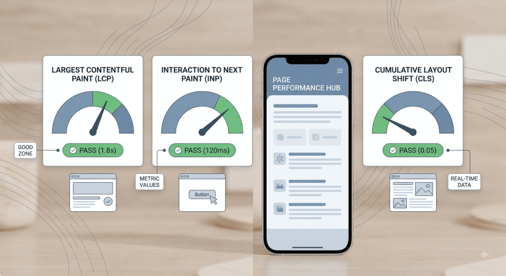
Core Web Vitals measure three things: how fast the main content appears, how quickly the page answers a tap, and how much the layout jumps while loading. A page passes when 75% of real visits hit the good threshold on all three. Mobile fails far more often than desktop.
| Metric | Good threshold | Mobile pass rate, 2025 |
|---|---|---|
| Largest Contentful Paint | Under 2.5 seconds | 62% |
| Interaction to Next Paint | Under 200 milliseconds | 77% |
| Cumulative Layout Shift | Under 0.1 | 81% |
| All three combined | Every threshold met | 48% |
Those figures come from the 2025 Web Almanac, drawn from July 2025 Chrome user data. Desktop passes at 56%, an eight-point gap. Loading is the usual failure point, because phones run slower processors on patchier connections. Interaction to Next Paint replaced First Input Delay in March 2024, which is why plenty of sites that looked green in 2023 turned amber overnight: the new metric watches every tap, not just the first.
Run your own numbers in PageSpeed Insights and read the field data at the top, not the lab score underneath. For diagnosis, Lighthouse in Chrome DevTools names the specific asset holding up the render. Mobile user experience problems show up as a number here long before a customer complains about them in words, which is why our website development team treats a failing mobile LCP as a build defect.
What does mobile-first web design for UK businesses actually involve?
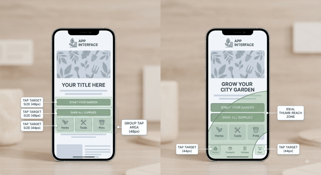
Start with the thumb. Primary actions belong in the lower two-thirds of the screen, tap targets need roughly 44 to 48 pixels of clear space, and forms should ask for the fewest fields that still qualify a lead. Full-screen popups on first load remain a mobile ranking liability.
What UK web design teams should build first
Order matters more than aesthetics. The phone layout gets built and tested on a real handset before anyone opens a desktop artboard, because decisions made at 1440 pixels are almost impossible to unwind later. Put it in the brief. The website design UK agencies quote you for should name mobile Core Web Vitals targets as an acceptance condition, not a post-launch aspiration. Our conversion-led interface work starts at the smallest breakpoint for exactly that reason.
Accessibility became a legal line in June 2025
The European Accessibility Act became applicable on 28 June 2025, and it applies on market access rather than where a company is registered. A UK business whose checkout an EU resident can complete is in scope. WCAG 2.2 Level AA is the working benchmark, and the Equality Act 2010 already covers UK customers on outcomes.
Enforcement moved quickly. Germany fined a retailer €150,000 over checkout alt-text failures, and the first EAA lawsuits were filed in France in November 2025. Most of what accessibility demands on mobile is the same work good mobile UX design already requires: readable contrast, generous tap targets, labelled form fields, menus you can reach without a mouse.
Frequently asked questions
1. Is mobile-first design the same thing as responsive design?
No. Responsive design is the technique, meaning fluid grids and media queries that let a layout adapt. Mobile-first design is the sequence you apply it in. A site can be fully responsive and still be built desktop-first, which is where most mobile problems originate.
2. How do I check whether my website is genuinely mobile-first?
Four checks give you an honest answer in about twenty minutes:
- Compare word counts on the mobile and desktop versions of your top three pages
- Run PageSpeed Insights and toggle to mobile field data
- Open the site on a mid-range Android phone on 4G, not on office wifi
- Try completing your main conversion action using one thumb
3. Does mobile-first design make the desktop version of a site worse?
Rarely. Mobile constraints force decisions about what content actually matters, and that clarity carries upward. Desktop layouts built from a mobile base tend to load faster and read cleaner, because nothing was inherited from a design nobody questioned. You add complexity deliberately instead of trimming it reluctantly.
4. Do Core Web Vitals really affect where a site ranks on Google?
Yes, though as a tie-breaker rather than an override. Relevance still decides most rankings. Between two comparable pages, the one passing all three thresholds at the 75th percentile has the advantage. The commercial case is stronger than the ranking case: slow mobile pages leak conversions regardless of position.
5. Does mobile-first design matter for B2B companies in the UK, where most traffic is desktop?
Yes. Google indexes the mobile version of your pages no matter who your audience is, so your desktop-heavy analytics do not exempt you. Buyers also research on phones between meetings and convert later on a laptop, which means the mobile visit shapes the shortlist.
Conclusion
Mobile-first design crossed from best practice into baseline requirement somewhere between Google’s July 2024 indexing switch and the EAA deadline last summer. The evidence sits in three places you can check today: your mobile field data, your content parity, and your accessibility conformance. Sites that pass all three are competing on message. Everything else is competing with a handicap it can measure but has chosen not to look at. Start with the Core Web Vitals report, then look at what your phone visitors are actually missing.