

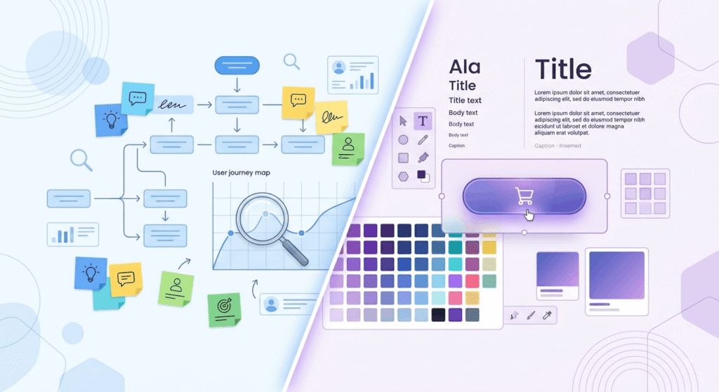
Quick Answer:The difference between UX and UI is scope. UX design covers the whole journey: research, structure, flow, and whether the product solves a real problem. UI design covers what lands on screen: typography, color, spacing, states, components. UX decides what gets built; UI decides how it looks.
TL;DR
- UX design is the plan. UI design is the surface. Different evidence too: user research versus visual craft.
- WebAIM’s February 2026 scan found 95.9% of the top million homepages failed WCAG checks. Low contrast led at 83.9%, a UI decision with UX fallout.
- Figma holds 82.3% of the interface design market, part of why US job ads ask for combined UI UX experience.
What is the difference between UX and UI?
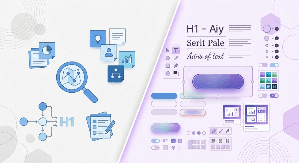
UX stands for user experience. UI stands for user interface. The difference between UX and UI is one of ownership: UX owns the problem, the research, and the path a person takes to finish a task. UI owns the screens that path becomes, down to button states and type scale.
Most explanations reach for the house analogy: UX is the foundation, UI is the paint. Tidy, and wrong in one way. Foundations get poured once. UX and UI keep correcting each other for as long as the product ships.
The confusion isn’t academic, it’s budgetary. Forrester’s often-quoted estimate puts the return on UX investment at $100 for every $1 spent.
What does a UX designer actually do?
A UX designer works out what to build before anyone worries about how it looks. That means interviews, analytics, flow maps, wireframes, and prototype tests run until the task gets easier. The output is rarely pretty. It’s a decision record, not a picture.
User research and usability testing
User research is the line item clients cut first and regret most. Jakob Nielsen’s 2000 rule, that five users find about 85% of usability problems, gets quoted everywhere. The condition attached to it almost never does.
The model assumes each problem has a 31% chance of surfacing with any one participant. Nielsen Norman Group’s math says that if your interface is already decent and that figure drops to 20%, you need nine participants for the same 85%. At 10%, eighteen. Five is a start for a rough product, not a finish line for a mature one. Unmoderated rounds through Maze keep the later tests cheap.
Wireframes, information architecture, and prototyping
Prototyping is where UX stops being an opinion. A clickable prototype answers what a slide deck can’t: can someone find pricing, do they understand the terminology, do they quit at step three. About 71.4% of designers surveyed by UX Tools prototype in Figma, so this stage rarely needs new software. It’s where MVP development earns its budget or exposes a bad assumption.
What does a UI designer actually do?
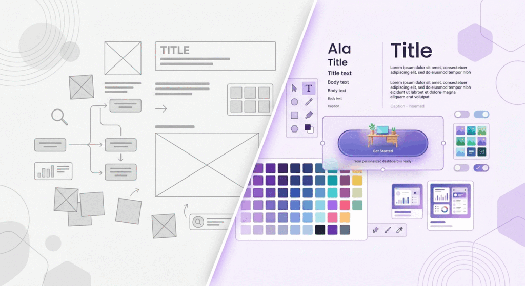
A UI designer turns the agreed structure into something people can see, read, and press. The work covers typography, color, spacing, iconography, motion, and every state a component holds: default, hover, focus, error, empty, loading. Consistency matters more here than novelty.
Typography, contrast, and the states nobody remembers
Typography does more work than any other visual decision on screen. Size, weight, and line height decide whether someone reads your value proposition or scrolls past it. Contrast decides whether they can read it.
WebAIM’s February 2026 analysis of one million homepages found low contrast text on 83.9% of them, up from 79.1% a year earlier. It’s the most common accessibility failure on the web, created in the design file, not the code. WCAG asks for 4.5:1 on normal text and 3:1 on large text, which WebAIM defines as 24px, or 18.67px bold. Checking a palette takes a minute with the WebAIM contrast checker.
Design systems and handoff
Figma holds 82.3% of the interface design tool market, per UX Tools’ survey of 2,220 designers. Adobe XD sits near 1.4%, effectively dead since Adobe cancelled its Figma acquisition in 2023. UI designers now define the variables and tokens engineers pull from through Figma’s Dev Mode.
User interface vs UX: a side-by-side comparison
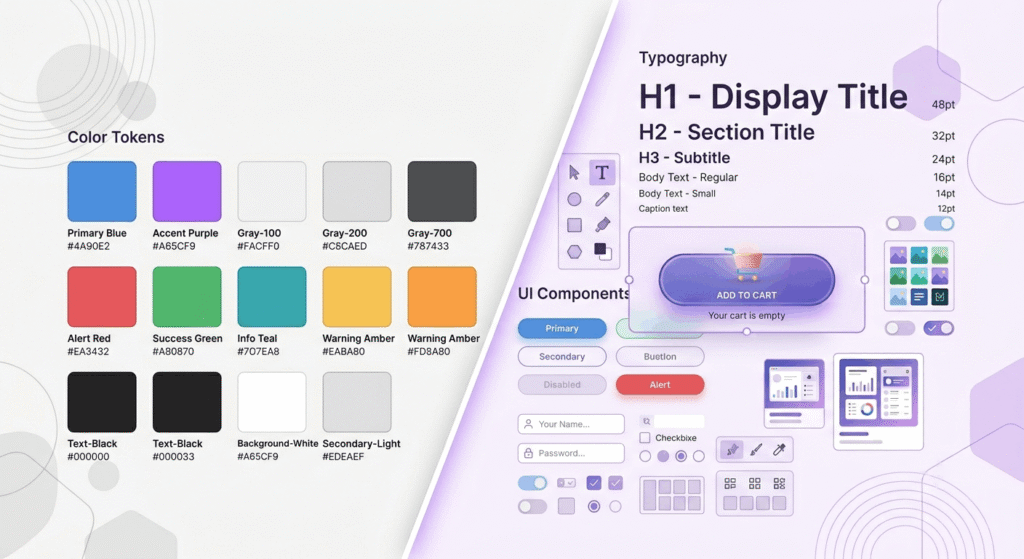
Put the two next to each other and the difference between UX and UI gets practical. Same product, same team, different questions asked at different moments. The pay figures below are US ranges from 2026 salary guides, and they move more by city than by title.
| Compared on | UX design | UI design |
|---|---|---|
| Core question | Does this solve the user’s problem? | Is this clear and usable on screen? |
| Main inputs | Interviews, analytics, usability tests | Brand, type scale, color tokens, components |
| Typical output | Journey maps, wireframes, prototypes | High-fidelity screens, design system, specs |
| Measured by | Task success, drop-off, time on task | Contrast ratios, consistency, first impressions |
| US pay, 2026 | $90,000 to $120,000 median | $85,000 to $110,000 median |
That last row is narrower than the internet suggests. Glassdoor’s combined UI/UX designer average sits at $104,552, a sign of how often US employers buy both skills at once.
How do UX and UI work together on a real project?
On a working team the two run as a loop, not a relay. Research shapes structure, structure gets styled, styling gets tested, and the test sends something back to research. Here’s the sequence most US product design teams follow on a new build.
- Agree on the problem and the number that proves it’s solved: signup completion, support tickets, time to value.
- Run user research. Five to eight interviews plus existing analytics kills the worst assumptions.
- Map the flow, then wireframe in grey boxes, so nobody argues about button radius while the structure is wrong.
- Test the clickable prototype, fix what breaks, then test the fix.
- Apply the UI layer: type scale, color tokens, component states, contrast pass.
- Ship, then measure against step one. Post-launch analytics restart the loop.
Titles blur here: at smaller US companies, one product designer runs the entire loop. We ran it end to end on a high-converting website for RevSquared AI.
Common mistakes to avoid with UX and UI design
The expensive errors are predictable. Teams schedule UI as a paint job for the final two weeks, skip research because someone in the room used to be a customer, or test once and treat the result as proof. Each one resurfaces as churn.
Styling an untested flow means paying for the same screen twice. Internal familiarity feels like user knowledge until real people touch the product, and about 88% of users say they won’t return after a bad experience. Almost none complain first.
The newest mistake moves faster. WebAIM’s 2026 report found errors per homepage rose 10.1% to 56.1, with part of that regression linked to AI-assisted coding. Generating an interface in seconds now generates accessibility debt at the same speed.
Which should come first, UX design or UI design?
Building something new? UX comes first, because there’s nothing to style until you know what the screens are. If you already have traffic and a conversion problem, the answer flips more often than people expect. Look at where users drop before deciding who to hire.Instant bounces usually point at the interface. A study in Behaviour & Information Technology found people form an impression of a page in about 3.5 seconds, with roughly 94% of first impressions tied to design rather than content. Drop-off at step three of a form is a different animal, and teams that can’t tell them apart need UI/UX and graphic design together.
Why job listings blur UI UX experience into one role
Most US postings ask for UI UX experience as a single requirement. The UX Design Institute’s read of the 2026 market describes employers moving toward smaller, specialized teams that favor designers pairing UX fundamentals with AI literacy. For a startup, one generalist plus scheduled research is usually right.
Frequently asked questions
1. Is UX or UI design harder to learn?
UI has the steeper beginning. Typography, color theory, layout, and tool fluency take months of practice before the work stops looking amateur. UX takes longer to master, because judgment only comes from running real studies and watching your assumptions fail.
2. Can one person do both UX and UI design?
Yes, and most US job postings assume it. The combination works when:
- the product is early and the scope is one or two core flows
- research is scheduled into the sprint, not squeezed around it
- a design system already sets the visual rules
- someone else owns the front-end build
3. Do UX designers need to know how to code?
No, though expectations are shifting. Smashing Magazine reported in April 2026 that UX roles increasingly ask for AI-augmented development and production-ready prototypes. Reading HTML and CSS well enough to talk with engineers is useful. Writing production React stays a developer’s job.
4. Which pays more in the US, UX or UI design?
UX, narrowly. 2026 salary guides put UX designers at roughly $90,000 to $120,000 median, against $85,000 to $110,000 for UI designers, while Glassdoor’s combined UI/UX designer average is $104,552. Product designers who cover both earn $110,000 to $160,000 and up.
5. Will AI replace UX and UI designers?
Not so far. AI generates screens in seconds, but WebAIM’s 2026 data ties rising page complexity and accessibility errors partly to AI-assisted development. Deciding what to build, what to cut, and what’s usable still needs someone accountable. Demand has shifted toward strategy.
Conclusion
The difference between UX and UI matters because the two failures look nothing alike and cost different amounts to fix. A product that’s beautiful and unusable needs research. One that works but looks untrustworthy needs a visual system. Diagnose which one you have.